Easy-to-Use Custom YouTube Banner Design Services Every Content Creator Should Know About
Why Your YouTube Banner Matters More Than You Think
Your YouTube channel art is the first thing a new visitor sees when they land on your page, and it sets the tone for everything that follows. A blurry, generic, or mismatched banner signals low effort before a single video is watched, costing you subscribers you never even knew you had. The good news is that you do not need a graphic design degree or a big budget to create something that looks polished and professional. Today’s custom YouTube banner design services are built with content creators in mind, offering intuitive tools, smart templates, and brand-ready features that make the process fast, accessible, and genuinely enjoyable.
What Makes a Great YouTube Banner (Before You Start Designing)
Before jumping into any design tool, it helps to understand what separates a forgettable banner from one that actually builds your brand. YouTube recommends uploading channel art at 2560 x 1440 pixels, but the “safe zone” where your content will appear on all devices sits within the central 1546 x 423 pixel area. Anything outside that safe zone may get cropped on mobile or tablet screens, so placing your most important text, logo, or face within that inner rectangle is critical.
Beyond dimensions, strong YouTube banners share a few common traits: a clear channel identity, consistent use of color and typography that matches the rest of your branding, and a visual hierarchy that guides the eye toward what matters most. Whether you post cooking tutorials, tech reviews, or travel vlogs, your banner should communicate your niche in a glance. Think of it as a billboard that has about two seconds to make an impression.
How to Choose the Right Design Service for Your Needs
Not all design tools are created equal, and the right one for you depends on your skill level, how much time you want to spend, and whether you need ongoing flexibility or a one-time solution.
Some services are template-heavy and beginner-friendly, letting you swap out colors, fonts, and photos without touching anything from scratch. Others offer more design freedom but come with a steeper learning curve. If you plan to refresh your banner seasonally or for special events, look for a platform that saves your brand assets so you can iterate quickly. If you just need something solid and permanent for a new channel, a robust template library might be all you require.
Pricing models vary widely too. Many tools offer a free tier with limited assets and export options, while paid plans unlock premium templates, brand kits, and high-resolution downloads. Evaluate what you actually need before committing to a subscription.
10 Tips for Getting the Most Out of YouTube Banner Design Services
1. Start with a Template Built for YouTube
The fastest path to a great banner is starting with a template that has already been sized and structured for YouTube channel art. Look for services that offer templates specifically optimized for the 2560 x 1440 pixel canvas and include visual guides for the safe zone. This eliminates the guesswork around cropping and lets you focus on customization rather than setup. Starting from a purpose-built template also helps you avoid common layout mistakes that make banners look amateurish on certain devices.
2. Lock In Your Brand Colors Early
One of the biggest mistakes new creators make is designing a beautiful banner that has nothing to do with the colors used in their thumbnails, intro videos, or social profiles. Before you drag a single element onto the canvas, decide on two or three core brand colors and stick to them throughout your design. Most modern design platforms let you input custom hex codes, so you can pull exact colors from your logo or existing content. Consistency across your channel signals professionalism and makes your brand immediately recognizable.
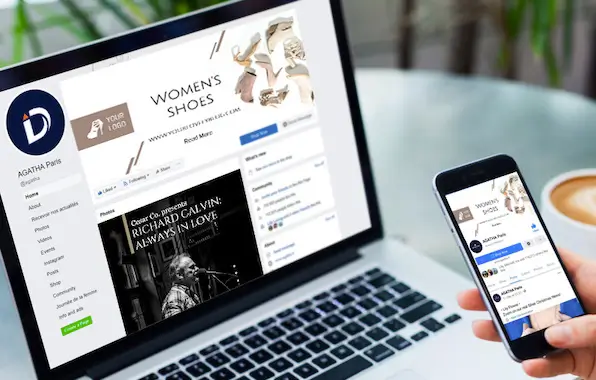
3. Use Adobe Express to Build a Custom YouTube Banner
For creators who want a powerful but approachable design experience, the YouTube banner maker from Adobe Express is a standout option. It combines a rich library of professionally designed templates with drag-and-drop customization, making it easy to produce channel art that feels bespoke without requiring hours of design work. You can upload your own photos, adjust fonts, apply color themes, and download your finished banner in the correct dimensions, all within a single browser-based workflow. Adobe Express also integrates with Adobe Fonts and stock photography, giving you access to high-quality assets that elevate the finished product well beyond what generic free tools can offer.
4. Prioritize Legibility Over Complexity
A banner crammed with too many elements ends up communicating nothing. Channel name, tagline, and upload schedule are the three pieces of information most creators try to include, and that is usually plenty. Choose a font that is readable at a small size, because your banner will appear much smaller on mobile screens than it looks in the editor. High contrast between text and background is non-negotiable. If your brand color is a medium tone, consider adding a subtle shadow or a solid block behind your text to ensure it pops on any background.
5. Make Use of Brand Kit Features
Many design platforms now offer “brand kit” functionality that lets you save your fonts, colors, and logos in one place and apply them to any project with a single click. If the service you choose offers this feature, use it. It dramatically speeds up the process of creating consistent designs across your banner, thumbnails, and social media graphics. It also makes onboarding a collaborator or editor much smoother, since your brand standards are already baked into the tool rather than living in a separate style guide document.
See also: How to Spot Operational Red Flags When Acquiring a Business
6. Include a Call to Action or Upload Schedule
Your banner is prime real estate for letting visitors know what they can expect from your channel. Adding a short phrase like “New videos every Tuesday” or “Subscribe for weekly tech reviews” gives potential subscribers a concrete reason to click that button. This is especially effective for niche channels where a specific cadence or topic focus is a selling point. Keep the text brief and place it in the safe zone so it is visible across all devices.
7. Test Your Banner Across Multiple Devices Before Publishing
Before you upload your finished design, preview it on a desktop browser, a tablet, and a smartphone. YouTube’s channel art rendering shifts depending on screen size, and elements that look balanced on a wide monitor can feel off-center or cramped on mobile. Most design services include a preview feature that simulates how your banner will appear on different devices. Use it. A five-minute review at this stage saves you from publishing something that looks great on your laptop but confusing everywhere else.
8. Use High-Quality Images and Avoid Pixelation
If your banner includes a photo of yourself or your products, resolution matters enormously. Upload the highest-resolution image you have and let the design tool scale it down rather than stretching a low-resolution file to fit. Pixelated banners read as unprofessional almost instantly. If you do not have high-quality photos of yourself, most design platforms give you access to stock photo libraries where you can find images that match your niche and aesthetic.
9. Align Your Banner with Your Current Thumbnail Style
Your banner and thumbnails do not have to be identical, but they should feel like they belong to the same visual universe. If your thumbnails use bold yellow text and high-contrast photography, a banner with soft pastels and script fonts will feel disconnected to a new visitor. Spend a few minutes looking at your existing thumbnails before you design your banner, and pull at least one or two visual decisions (a color, a font weight, a border style) into the channel art to create visual harmony across your page.
10. Refresh Your Banner for Milestones and Campaigns
Your banner does not have to be permanent. Many successful creators update their channel art to reflect subscriber milestones, new series launches, or seasonal content. Design services that save your projects make this easy, since you can duplicate your existing banner and make targeted edits rather than starting from scratch each time. Planning a 30-day challenge or a holiday series? A custom banner designed for that event builds anticipation and signals to returning subscribers that something new is happening.
Free vs. Paid: Which Tier Is Right for You?
Most design services worth using offer a functional free tier, but understanding what you give up is important before committing to the free version long-term. Free plans typically limit you to a subset of templates, restrict access to premium stock images, and may add a watermark or reduce export resolution. For a brand-new creator just getting started, a free tier is often more than enough to produce something presentable while you find your footing.
Once your channel starts to grow or you want more creative control, upgrading to a paid plan usually unlocks a much wider template selection, brand kit features, priority exports, and access to licensed stock assets. The cost is generally modest, especially compared to hiring a freelance designer for a one-off project. If you plan to design thumbnails, social posts, and other visual assets regularly, a paid plan at a single platform becomes a genuinely efficient investment.
Common Mistakes to Avoid When Designing YouTube Channel Art
Even with a great tool, a few common missteps can undermine an otherwise solid design. The most frequent one is designing entirely at the full 2560 x 1440 pixel size without accounting for the safe zone, then being surprised when key elements disappear on mobile. The second most common mistake is using too many fonts. Stick to two at most: one for your channel name and one for any supporting text. More than that and the design starts to look chaotic rather than creative.
Another mistake is neglecting negative space. White space (or whatever your background color is) is not wasted space. It gives the eye a place to rest and makes the elements that are present feel intentional and premium. Overcrowded banners signal inexperience, while restrained, well-spaced designs tend to read as confident and polished. When in doubt, remove an element rather than adding one.
Frequently Asked Questions
What size should my YouTube banner be, and does it really matter?
YouTube’s recommended upload size for channel art is 2560 x 1440 pixels, and yes, it matters quite a bit. Uploading at a smaller size or in the wrong aspect ratio will result in stretching, pixelation, or unexpected cropping on certain devices. The file should be under 6 MB and saved as a JPG, PNG, BMP, or GIF. The most important concept to understand alongside dimensions is the “safe zone,” which is the central 1546 x 423 pixels where your design will be fully visible on desktop, mobile, and TV screens simultaneously. Any design elements placed outside that zone risk being cut off depending on where a viewer watches. Designing within the safe zone first and then filling the outer canvas with complementary background color or texture is the safest approach for any creator.
How often should I update my YouTube channel art?
There is no fixed rule, but most branding experts suggest reviewing your channel art at least once or twice a year and refreshing it whenever your content focus significantly changes. If you started a cooking channel and have since pivoted to food travel content, a banner that still shows a stovetop and mixing bowls no longer reflects who you are. Milestone updates, such as hitting 10,000 or 100,000 subscribers, are also common and create an opportunity to celebrate with your audience while keeping your page feeling current. For creators who run seasonal campaigns or limited series, designing event-specific banners and rotating them in temporarily is a smart engagement strategy that signals active, intentional channel management.
Can I use my YouTube banner on other platforms too?
Your YouTube banner is specifically sized for YouTube’s channel art display and will not translate directly to other platforms without resizing. Twitter headers, Facebook covers, and LinkedIn banners all use different dimensions and aspect ratios. That said, the visual identity you establish through your YouTube banner, your color palette, typography, and overall aesthetic, should absolutely carry over to all your other social platforms. Most design tools let you duplicate a project and resize it for a different platform, which makes maintaining visual consistency across channels much more manageable. If cohesive multi-platform branding is a priority for your creator business, it is worth choosing a design service that explicitly supports resizing and multi-format exports.
What should I include in my YouTube banner text?
Less is almost always more when it comes to text in YouTube channel art. At minimum, you should include your channel name, especially if it differs from your personal name or is not immediately obvious from your profile photo. Beyond that, a one-line tagline that describes your content (“Weekly personal finance tips” or “DIY home projects for beginners”) and an upload schedule are the two most valuable additions. Avoid trying to include social media handles, long descriptions, or multiple calls to action. Most viewers will only spend a second or two looking at your banner before scrolling to your videos, so clarity and brevity are far more effective than comprehensiveness. If you need help writing compelling, concise copy for your banner and other channel elements, a tool like Hemingway Editor can help you tighten your language and flag anything that reads as overly complex.
Do I need design experience to create a professional-looking YouTube banner?
Absolutely not. The current generation of browser-based design tools has made professional-grade visual design genuinely accessible to people with no prior training. Template-based platforms do the heavy lifting in terms of layout, hierarchy, and visual balance, so your job is primarily one of customization: swapping in your colors, uploading your logo or photo, adjusting your channel name and tagline. That said, a basic understanding of a few design principles, such as the importance of contrast, font pairing, and the safe zone concept discussed throughout this article, will help you make smarter decisions within whatever tool you use. Spending 20 to 30 minutes reading a brief introduction to visual design fundamentals before you sit down to create your banner will pay dividends in the final result.
Conclusion
Creating a custom YouTube banner that reflects your brand and attracts new subscribers has never been more accessible. With a range of intuitive design platforms available at every price point, and with purpose-built tools like Adobe Express streamlining the entire process, there is no reason to settle for a generic or outdated look. The tips outlined in this article give you a solid foundation: start with the right dimensions, prioritize clarity, stay consistent with your brand identity, and use the features your chosen platform offers to work smarter rather than harder.
Your channel art is one of the few elements of your YouTube presence that speaks to every single visitor, whether they arrived from a search, a recommendation, or a friend’s share. Treating it as the valuable piece of digital real estate it is, and revisiting it as your channel grows, will set you apart from the vast majority of creators who upload once and forget it. Invest the time, use the right tools, and your banner will do quiet but meaningful work on your behalf every single day.